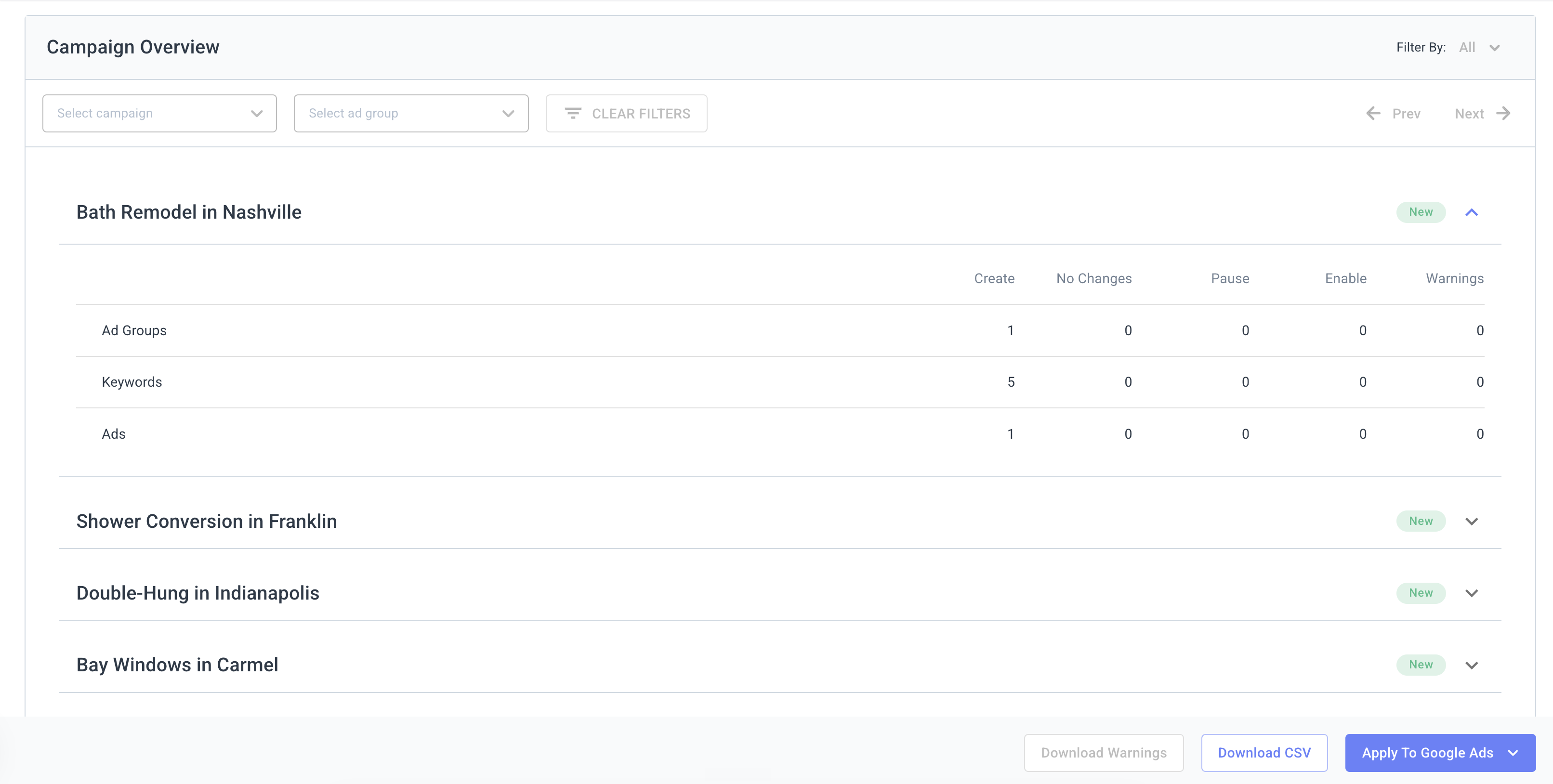
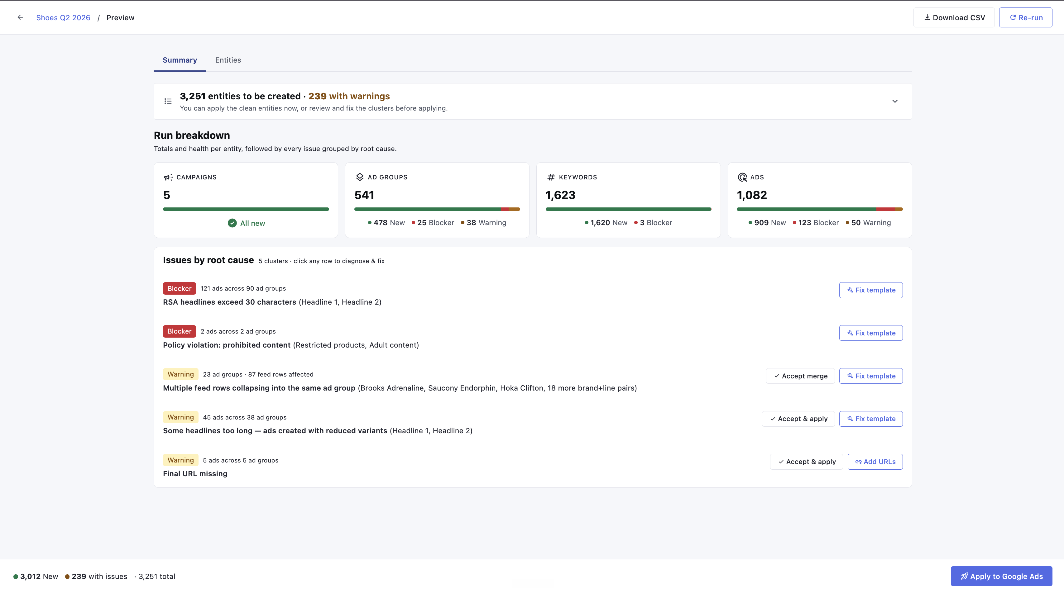
Campaign Automator builds Google Ads campaigns from a product feed at a scale no human could maintain by hand. Its preview is where users approve thousands of changes to a live ad account. I rebuilt that screen from the decision up: the moment where the product's entire promise is either kept or broken.
259 → 5Warnings on the demo run, clustered to root causes
−33%Median time from first preview to apply
real reads, 8 weeks after ship
30-second version
Campaign Automator is a standalone, separately billed product, and its preview is the one screen where Optmyzr's market position, automation with a human in between, is actually experienced. That screen reported exact counts and told users nothing about what to do. I mapped six jobs the preview is hired for, found the old screen designed around one and a half of them, and rebuilt it as a decision interface: a verdict, impact in business language, warnings clustered by root cause, and a fix workspace that repairs templates where problems are found. Four round trips per fix became one. Eight weeks after ship, median time from first preview to apply was down a third, and Campaign Automator tickets per hundred active templates were down about a quarter. The deeper win has no expiry date: the warning taxonomy is now classified at the source, in the codebase, so every future surface inherits the same diagnostic vocabulary.
Section 1 · Why this screen, why now
It started with a ticket. Then another. Then the same one again.
Customers kept writing to support with a request that should worry any product team: can you fix this for us? Not "how do I fix this." Fix it for us. Campaign Automator's preview would flood them with warnings they could not interpret, so they handed the whole job back to the humans. The product had quietly outsourced its own complexity to the support team, one ticket at a time. The ask that eventually landed on me came through our support lead and my PM, and it was informal and enormous: Shivam, can you look into this? No brief, no deck, no budget line.
Looking into it turned up two facts that made this a strategic project rather than a UI cleanup.
It is a product, not a feature. Campaign Automator is sold standalone and billed separately from an Optmyzr subscription. Its preview is the trust gate between the user and a customer's live ad account, and the first-run preview is the single most influential moment in first-time use. A bad first preview means the user concludes the tool is unreliable, no matter how robust the engine underneath is. A confusing preview fails in both directions: it delays apply, blocking the value the customer is paying for, or it pushes broken entities live, creating support load and risking account integrity.
Trust is the whole market right now. Over half of PPC professionals say managing paid media has gotten harder in two years, and the reason they cite is black-box automation taking control and insight away. Optmyzr's answer is its stated differentiation: automation with a human in between, a preview before anything goes live. Which means this screen is not a checkpoint inside the product. It is the positioning, rendered as UI. If the preview cannot explain itself, the differentiation is a slogan.
The cost of confusion, sized. Before pixels, I put numbers on the problem the way a PM would, with a back-of-envelope model and its assumptions on the table:
None of these are measured outcomes. They are the sizing that made the case for build time.
The brief I took to my PM was not "improve the preview." It was: this screen has to carry the company's differentiation into the AI era, by becoming the diagnostician its users are ceasing to be.
Section 2 · The research
From "fix it for us" to a PRD engineering could build from.
The tickets were the symptom. The research had to find the disease, and it ran in the order the evidence suggested, each stream handing a question to the next.
Stream 1 · Support tickets
What are people actually asking for?
I read and tagged 117 support tickets by hand over two days. One in three customers were not reporting bugs. They were asking support to make the fix for them, because the warnings were too confusing to act on. The same few problem types kept repeating, and those became the first draft of an eight-category warning taxonomy.
117 tickets, tagged by hand38 of 117 said "fix it for us"
Stream 2 · Mixpanel funnels
Where exactly do users give up?
I listed the questions I needed answered, and the data team pulled the numbers from Mixpanel: messy first runs against clean ones, across three months of usage. When a first run showed more than 20 warnings, users abandoned it three times more often. Those who kept going had to re-run the preview four times on average before finishing. Recordings showed them opening rows one by one, hunting for buried warnings. Clean runs, by contrast, were approved in under a minute.
3x abandonment above 20 warningsMedian 4 re-runs per fix
Stream 3 · Field immersion
I broke it myself, on purpose.
I used the tool the way a customer would: a real shoe catalog and an AI-generated template. Then I planted one defect, a headline longer than Google's 30-character limit. That single mistake triggered three separate alarms in three different places: 121 ad warnings, 90 ad-group warnings, and around 270 orphaned keywords. The tool knew they were connected. The interface never said so.
1 defect, 3 alarms121 + 90 + ~270 warnings
Stream 4 · Competitive teardowns
Has anyone solved this already?
I studied how three competitors handle the same moment in their flow. Each had one idea worth borrowing: Channable's realistic ad previews, Smartly's plain-language summary of what a template covers, and DataFeedWatch's grouping of 5,000 product errors into about 12 root causes. That last one was proof that grouping by cause works at scale.
"Show me everything broken, sorted, so I can fix it in bulk. I have 8 other accounts today."
The bulk-fixing strategist
"Is this safe to click? I do not want to break my client's account."
The cautious operator
I kept both voices as design constraints rather than dressing them up as personas; the tickets said it better than any composite could. With a team of two and no research budget, these 117 written voices were the project's user research.
From evidence to structure. The four streams converged into the PRD in three moves: pick the moment that matters, score the old screen against its jobs, name what is broken.
Move 1
Pick the moment that matters
Seven use cases mapped, from "first run, all clean" to "scheduled run, anomaly." Scheduled runs are the traffic, but the messy first run is where trust forms, where the paying account is most fragile, and where every abandonment in the funnel data lived. So it became the design target, deliberately.
design for the judgment moment — the routine moment gets fast for free
Move 2
Score the old screen against the six jobs it is hired for
A blunt three-point audit of every job: served, half-served, or unserved.
1 served · 1 half · 4 unserved
built for 1.5 of its 6 jobs — this score carried the whole project
Move 3
Name what is broken, precisely
Seven named failure modes turned vague complaints into a problem statement engineering could build against. Among them:
"Optimizes for accuracy, not action""One defect looks like 259 problems""No fix loop, only a re-preview loop"
#
The job
Old preview
Shipped as
1
Verify a new template's structure before it goes live
Served
Verdict + run breakdown
2
Know whether Apply is safe
Unserved
Verdict with exact counts, severity by consequence
3
Understand root causes and fix efficiently
Half-served
Clusters + the fix workspace
4
See what changed since the last scheduled run
Unserved
Run-to-run change summary: added, removed, and edited since last run
5
Spot-check that a recurring sync has not drifted
Unserved
Rendered ad previews + per-row breakdowns
6
Show a client what is about to happen, in business language
Unserved
Coverage and in-stock framing an agency can screenshot
The audit that carried the project: one served, one half-served, four unserved.
One principle sat on top of the PRD: order the screen by the questions people ask, in the order they ask them. Everything in the next section traces back to a row in this table.
Section 3 · The decisions
Three calls that shaped the screen, and one argument that shaped the system.
Decision 1 (job 3): cluster by root cause, not by symptom. "259 entities with warnings" became "5 issues, each naming its cause in plain language." Severity got honest: a blocker stops the ad, a warning only degrades it. Underneath, an eight-category taxonomy separates small surgical edits from structural redesigns, so the fix path matches the size of the problem.
The argument with engineering, because it decided how fixing works. My first flow saved every fix straight to the backend and reloaded the preview to show the result. Engineering pushed back, correctly: regenerating the preview is the most expensive operation in the product. On a large feed, every save-and-reload is a real wait, and a messy first run needs several fixes.
Rejected
Save and reload per change
Every edit writes to the backend and regenerates the whole preview. Always accurate, but each fix costs a full reload. Five fixes, five waits.
Shipped
Batch edits, save once
Changes collect in the side tray. A single Save commits them all and reloads the preview once. Five fixes, one wait.
That one decision shapes the whole fix experience. The tray sits on top of the preview, edits accumulate, and the preview only regenerates when you ask it to. It is also where the loop tax from Section 1 actually gets paid down.
Clustering raised its own honest question: is a root cause even traceable for every warning? No. The eight categories split into three handling classes:
Traceable to the template
Text that runs too long, missing attributes, naming collisions. The system knows which pattern caused it.
Traceable to the feed
Out-of-stock rows, broken URLs, bad price formats. The defect lives in the customer's data, not the template.
Traceable one run back
Drift and account-level conflicts. The preview now diffs the current run against the last one only; the cause beyond that lives outside it.
The fight I lost, and why the screen is better for it. I designed four severity levels: blocker, error, warning, notice. Engineering and my PM pushed back together. Every extra level needs a defensible rule across all eight categories, and users do not act on four levels anyway. Support's own ticket language used exactly two words: "broken" and "ugly." We shipped two. They were right. It is the one piece of the design support adopted as vocabulary without being asked.
Red: stops the adAmber: degrades it
Decision 2 (jobs 1, 2, 4, 5, 6): six layers of information, two surfaces. The screen is organized by the questions people ask, in the order they ask them. The Summary holds the decision layers. A tabbed Entities workspace holds the investigation layers, including the detail table our power users had years of muscle memory in: demoted, not deleted, upgraded with search and severity filters.
01The verdictIs this safe to apply?Summary
02Business impactWhat does this mean for the account?Summary
03Root-cause clustersWhat is broken, and why?Summary
04Spot-checkWhat will the ads actually look like?Summary
05Detail tableLet me inspect every row.Entities
06Diff vs last runWhat changed since the last run?Summary
Six layers, ordered by the questions people ask, in the order they ask them.
The spot-check is sampled deliberately, not randomly, so edge cases get seen before they go live:
The typical rowThe longest nameThe shortest nameOne random pullThe ugliest on the run
The cautious operator reads the Summary and leaves confident. The bulk-fixing strategist heads straight for Entities. Same truth, two exit ramps, one per ticket voice.
Decision 3 (job 3, again, because it was the bleeding one): kill the re-preview loop. Two structures went through pressure testing with my PM.
Demoed better
Option B: one screen
Everything compressed onto a single screen, with a side tray for fixes. Impressive in a demo. Falls apart on large, messy runs, exactly when the stakes are highest.
Shipped
Option A: two surfaces
Summary split from the workspace. Less flashy, more durable. B's best idea survived inside it: the fix workspace.
Open any cluster and it names the cause using the real feed values that break it ("Saucony Endorphin Pro 4 in Hydrogen Blue pushes the template past the limit"), then offers the matching fix: repair the pattern once for every affected ad, or override a single row. A live counter previews the worst case against real data, so you watch 44 characters become 28 before you commit. Four save-and-reload round trips became one batch of edits and a single Save, made where the problem was found.
The rule that governed scope. Two builders, one PM, and a vision bigger than the capacity. We settled every fight with one line: work that changes the user's decision ships first, work that improves it can follow.
What I left out, deliberately. Ad mockups everywhere, Channable-style. A thousand rendered ads is noise wearing a nice outfit. Mockups appear only in the spot-check and the fix flow, where they earn trust instead of burying it.
Section 4 · What happened
The screen shipped. The system is the outcome.
The durable win first, because it outlives the metrics. The taxonomy moved error classification from the UI into the source: every warning is now born with a category, a severity, and a root-cause key. Three things follow from that.
Every surface inherits it
Emails, API responses, the AI template generator — all speak the same diagnostic vocabulary, without anyone redesigning it.
Support adopted the language
Blocker vs warning became a shared triage vocabulary. Support was using the two-word split in ticket replies within weeks of ship.
It became the trust artifact
The preview is what a PPC manager points at when a client asks "how do you know the automation is safe." In a market losing trust in black boxes, that answer is the product.
The numbers. Targets were set in the PRD before build. Actuals were read eight weeks after ship against the eight weeks before, ship week excluded — the same funnels that defined the problem, re-run, not new measurement built after the fact.
Metric
Target
Read at 8 weeks
Median time, first preview load to apply
−30%
−33%
Apply completion after a warning-heavy first preview
Increase from baseline
Roughly 1 in 3 → roughly 1 in 2
CA support tickets per 100 active templates
−20%
About −24%
Applies with zero remaining warnings
Increase
22% → 41%
targets written before build — all four met or beaten
How each number was measured
The instrumentation was set up by our engineers. The logic is mine: I defined what each number counts, what it excludes, and why — which is the part below.
Time to apply
Mixpanel. Event pair: first `preview_loaded` to first `apply_confirmed` per new template. Median across templates, not sessions, so one obsessive user cannot skew it. Windows: 8 weeks pre-ship vs 8 weeks post, ship week excluded from both.
Apply completion on messy first runs
Same funnel, filtered to first-run previews above a warning-count threshold. Numerator: sessions reaching `apply_confirmed`. Denominator: all such first runs. Same two windows.
Tickets per 100 active templates
Numerator from the support tool: tickets tagged Campaign Automator, counted per window. Denominator from a product-database query: templates with at least one run in the window. Normalized because raw ticket counts lie when the customer base grows.
Zero-warning applies
A property on the apply event: remaining warning count at the moment of Apply. Share of applies where that count is 0, both windows.
Why there is no revenue number, on purpose. Eight weeks is too short to read churn on an $89-per-month line item, and billing lives in a system my funnels do not join to. The leading indicator is the table's second row: the stall at a warning-heavy first preview was the churn mechanism, and 1 in 3 → 1 in 2 is that risk shrinking, at the resolution I can actually measure.
Related scope: this preview was the centerpiece of a broader workstream in which I closed 50+ open issues across Campaign Automator. The 50+ spans the workstream; this redesign is the deepest cut of it.
The preview now answers the ticket before the customer writes it.
Support, paraphrased from a Slack thread
Section 5 · What I'd do differently, and what stuck with me
The honest ledger.
What I'd do differently. Seed the run log in v1: the first run wins trust, but the hundredth run is where customers live. And pull people in at the sketch, not the proposal — support already had the severity language, engineering had the better clustering idea, and three live customer walkthroughs would have bought a certainty funnels cannot.
What stuck. A screen that reports symptoms is quietly outsourcing the diagnosis to the user; clustering by cause was the actual design work. The project's best decision, classify at birth, came from pushback, not from my first idea. And when AI writes the user's inputs, the system inherits the obligation to explain itself. That shift is bigger than this screen.