Tickets kept climbing
The product was growing, so some of that is expected, but support cost per customer was rising too, which is the wrong direction for anything you plan to scale.
Campaign Automator had 143 open issues waiting on design and no designer. I wanted to rebuild the worst screen, and the founders said no. So I spent a quarter working through all 143 by hand instead, and that slow work turned up the real finding: the screen with the most complaints was not the screen losing us customers.
Two phases, one product. I wanted to rebuild the worst screen and the founders said no, so I spent a quarter closing 143 consolidated issues inside the product as it was, one at a time. That slow work produced the finding: the screen with the most complaints (the template editor, 89) was not the one losing us customers (the preview, 13). People cursed the editor and finished; they hit the preview and stopped. Fixing the preview became phase two, and this time the answer was yes. New issues logged fell from 143 to 51 across matched three-month windows, and median time from first preview to apply came down a third.
Section 1 · How this started
Optmyzr is a platform for running paid search ads at scale: agencies, in-house teams, serious budgets. Campaign Automator sits inside it but is sold and billed separately. Give it a product feed, say a retailer's forty thousand shoes, and it generates Google Ads campaigns automatically and keeps them in sync as inventory changes. You set up a template, connect your feed, and the tool does the rest.
The billed-separately part matters. Confuse someone inside a subscription and you lose goodwill. Confuse them in a product they pay for on its own and you lose the renewal, at exactly the moment they are asking whether the automation can be trusted.
When I joined, the product had 143 open issues waiting on design and no designer, built up over about a quarter from support tickets, an internal audit, and friction relayed by account managers.
One thing about that number, because it shapes everything else. Those 143 are consolidated issues, not raw tickets: a new ticket matching something already logged gets merged in, not opened fresh. So there are no duplicates, and the customer contact behind them is a much larger number.
My first instinct was to rebuild the core configuration screen. The founders said no, and not for cost. Customers were in that screen every working day and had built habits around it, bad parts included. Rebuilding meant taking that away to fix things that irritated but did not block, and they would not spend customer patience on that trade.
I disagreed at the time. So I spent a quarter working through all 143 by hand, inside the product as it was. That slow, unglamorous work produced the finding: the screen with the most complaints was not the screen losing us customers. A different screen was, with barely any complaints at all. Fixing it became phase two, and this time the answer was yes.
Section 2 · What was actually going wrong
First thing to establish, because it decided everything after: the product worked. Feeds came in, campaigns came out, inventory changes flowed through correctly. Not one of the 143 issues said the product could not do the job. What they said, over and over in different words, was that it would not explain itself.
The problem
Campaign Automator does the job customers bought it for, but it cannot tell them what it is doing, what it needs from them, or how to recover when it stops. So customers hand the interpreting to support. Support absorbs it, and everyone keeps moving.
That last part is why it stayed unfixed for so long. Absorbing it kept customers unblocked, which turned a design problem into a headcount cost and made it invisible on every dashboard except support's.
The cost of that showed up in four places.
Tickets kept climbing
The product was growing, so some of that is expected, but support cost per customer was rising too, which is the wrong direction for anything you plan to scale.
The same questions kept coming back
Because incoming tickets merge into existing issues, you can see repetition in the shape of the tracker. Some of the 143 were a single line with a dozen conversations behind them. New problems arrive scattered; concentration like that means a hole in the product, and holes are design work.
Support was doing tooltip duty
The team spent its hours walking people through configuration steps rather than the cases that genuinely need a human, so the hard cases waited longer behind the easy ones.
Trust was leaking
A customer who waits two days to find out why their preview looks wrong is learning that the automation cannot be trusted without a human checking it, which is the opposite of what they bought. That is very hard to unlearn.
The numbers, by surface. By volume, the template editor was the obvious place to spend the effort.
143 issues by surface. Hold onto the bottom row, 13 issues on the preview page, because Section 5 is about how it outweighed the 89.
The numbers, by kind of problem. I read and tagged all 143 by hand. Each square below is one issue, coloured by what kind of problem it was. You can see the answer before you read a number: the reds, the comprehension problems, swamp the greys.
81% of what customers experienced as the product being broken was the product failing to explain itself.
The ratio that made this a design project
Section 3 · Reading all 143
I started with the support record rather than user interviews, because the record already was a huge sample of the exact moment I cared about: the moment someone stopped being able to move forward. But 143 issues is a list, not a brief. Turning it into one took two weeks, and there was no shortcut, because the tagging is the analysis. I put everything in one spreadsheet and read every issue, tagging three things: which screen it happened on, what kind of problem it was, and what the person was trying to do when they hit it. The third tag is the one that changed the design, and it is also the one I could not fill in on my own.
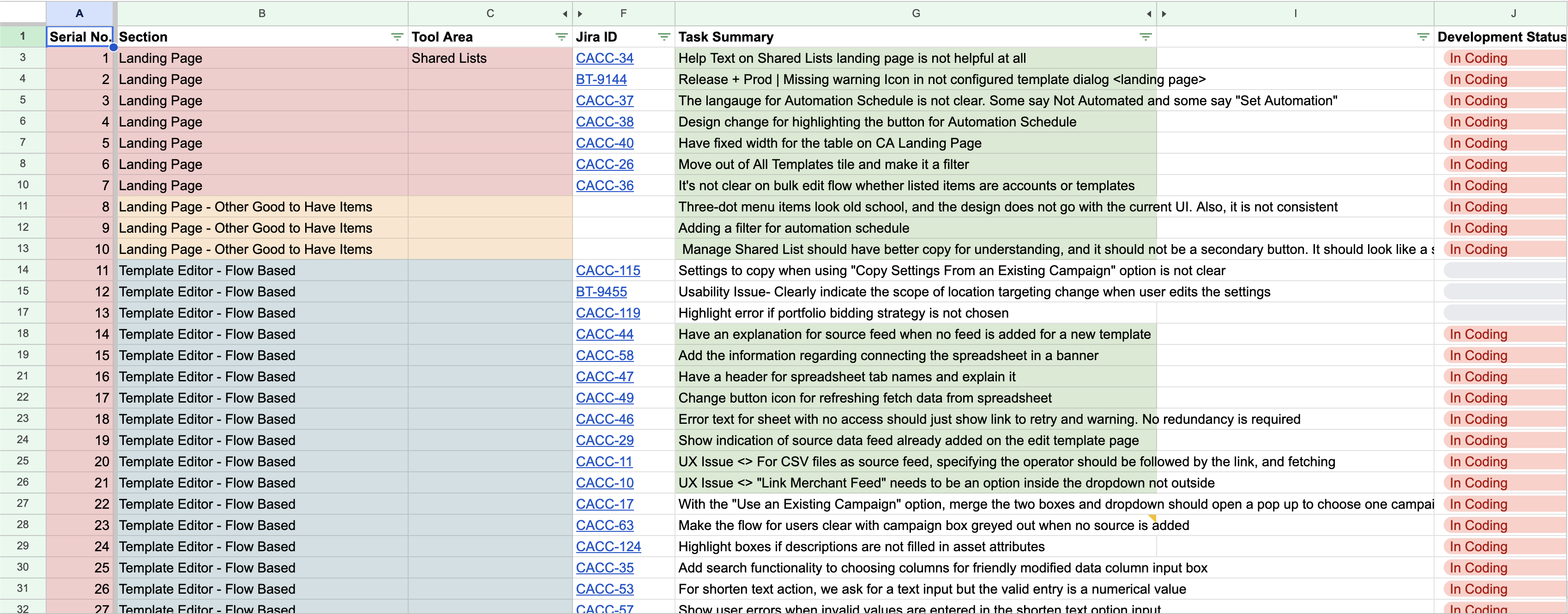
Here is what a row actually looked like. The line read: users do not understand Modified Columns. From that I could tag the screen (the data-source flow) and the problem type (did not know what the step wanted). The third column stayed empty. The line is a summary someone wrote when the tickets were merged, and merging strips out who was asking and what they were in the middle of. A large part of my sheet sat like that: two columns filled, the one that mattered blank.
So I booked time with support and went down the list row by row, because they knew who was behind each line. Modified Columns turned out to be two different people: one setting up a first template, needing to know what the field did; the other with a live campaign that had just broken, needing to know which column caused it. One row, two problems, no shared fix. Working from the line alone, I would have written a tooltip and left half those customers stuck. That happened on enough rows to change the shape of the work: support gave back the context the tracker threw away when it consolidated.
What the tagging produced: six themes. The three comprehension themes together account for 115 issues, 81% of everything documented.
Did not know what a step wanted
57 · 40%"How do I" tickets, concentrated in configuration: inventory filters, modified columns, campaign settings. Nothing had failed. Nothing had told them what success looked like.
Help existed but lived elsewhere
30 · 21%A knowledge base outside the product. People did not go and get it. Documentation that is not present at the point of confusion functionally does not exist.
The interface itself was unclear
28 · 20%Field names that assumed knowledge the user did not have, carrying no inline explanation. Inconsistent layouts, dense tables with no filtering.
Actual bugs
21 · 15%Real defects. Far fewer than the ticket volume implied, which is itself the finding.
Feature requests
5 · 3%Small. Customers were not asking the product to do more.
Other
2 · 1%Scattered.
What people actually did when they got stuck. Counting issues tells you where the problems are. Reading them next to the workflows tells you what people did. Four patterns came out.
01
They failed silently, then wrote in
Validation ran only on save, so nothing told them what broke.
02
Errors reported instead of helping
Accurate errors with no way to act on them, so people guessed.
03
Nobody read the docs
The help lived in another tab nobody opens mid-confusion.
04
Even the experts got stuck
Hidden state: one change could silently break something two screens away.
That last pattern killed "make it simpler" as a strategy. You cannot simplify your way out of invisibility.
Two kinds of user, same root cause.
Agencies & PPC managers
Use the product constantly, so every unclear field is a tax paid many times a day. They had also become the unofficial support desk for their own teams, pulled off the campaign strategy they are actually paid for.
In-house advertisers
Use it rarely, with higher stakes each time. Without the muscle memory a heavy user builds to route around bad design, every session started cold. One group paid the comprehension tax over and over; the other could not pay it at all.
The brief that came out of it. Two framings were on the table when I started, and the research killed both.
Put the explanation where the confusion happens, and stop errors before they need explaining at all.
Section 4 · What I built
Nothing moved that customers had already learned.
1 · Help where the confusion is
The data-source flow asked people to configure feeds, column transformations and campaign structure with zero guidance. Nothing said what a step expected, what the output would look like, or what order to work in. I added a "how it works" walkthrough at the top of the flow, numbered stages that each show only what is relevant to them instead of dumping the whole configuration surface at once. Descriptions and tooltips went on every field that assumed knowledge the tickets proved people did not have: Source Data Feed, Inventory Filters, Modified Columns, Campaign Attributes. And for data transformations, a live before-and-after preview, so you can check a change against real data before committing.
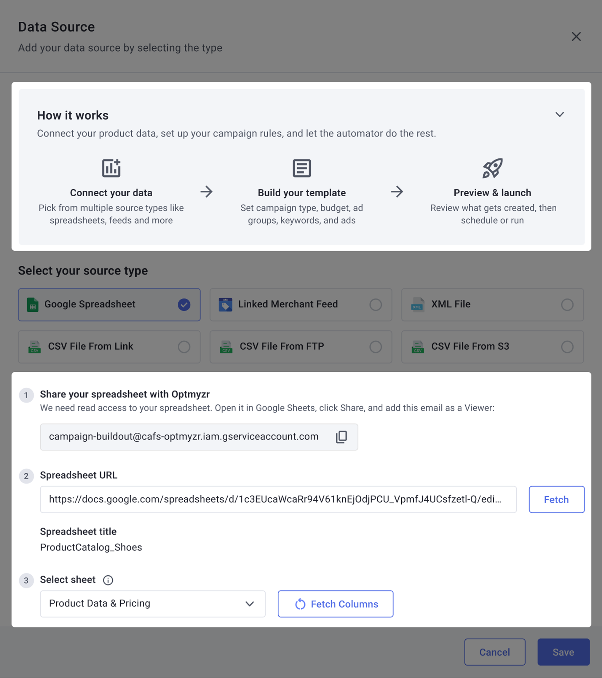
Why not a product tour
A dismissable first-run tour was cheaper and worse. It helps your first session and abandons you on your fifth, which is exactly backwards for the in-house advertiser who returns after six weeks having forgotten everything. Persistent, collapsible guidance costs a power user one click. Its absence costs an infrequent user a ticket. This targeted the biggest cluster directly, the 40% of issues where people did not know what a step wanted.
2 · Errors that help instead of announce
Error handling drove more repeat tickets than anything else. Messages were generic and only appeared on save, after twenty minutes of work. The loop was: configure, save, "something is wrong", guess which thing, repeat, give up, write in. I built three layers, because the failure was happening at three different moments.
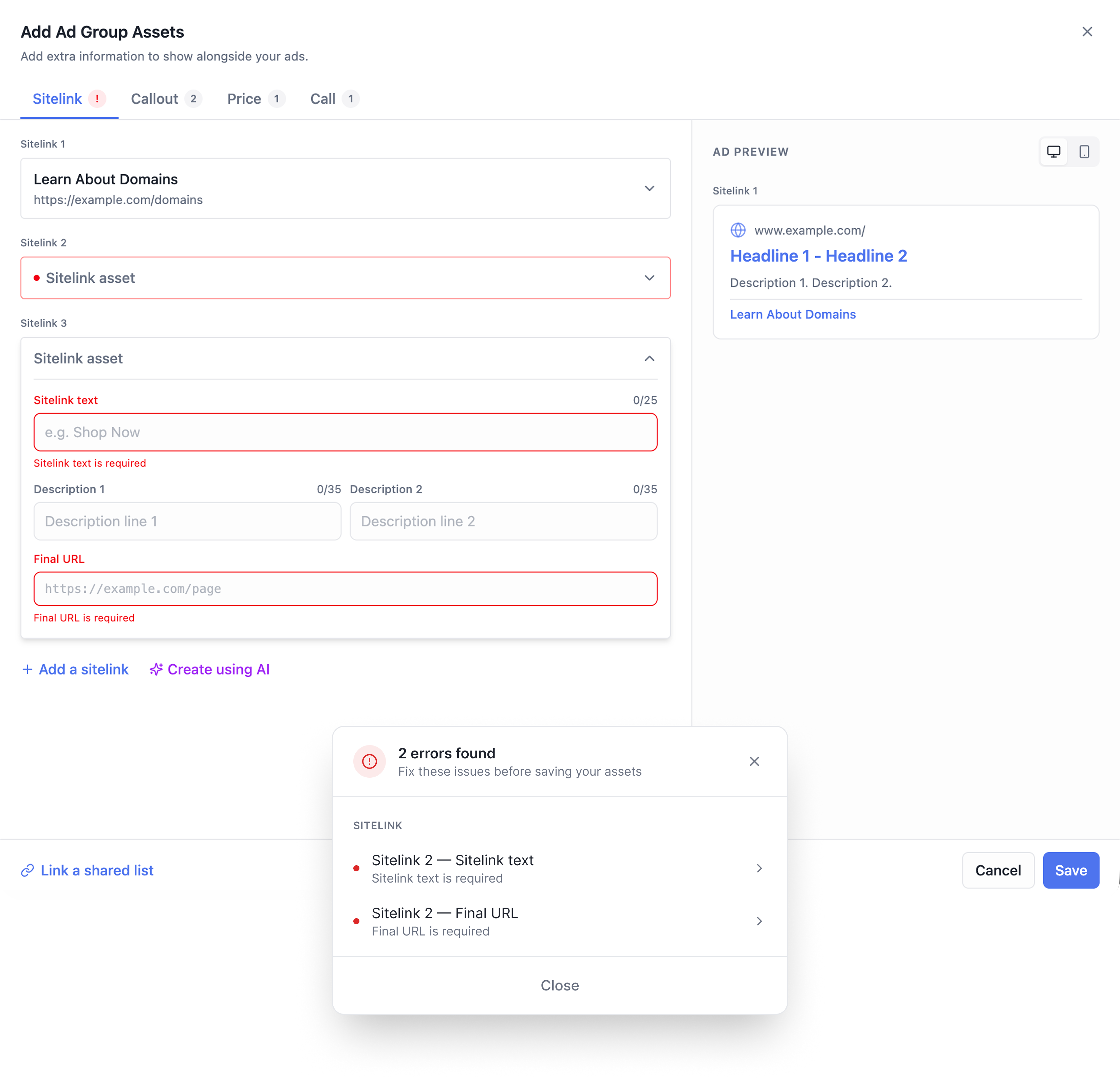
One tuning note
A single inline validator would have solved the first moment and ignored the other two. And validating on every keystroke scolds people mid-typing, so format rules check when you leave a field, cross-field dependencies check on save, and only genuinely instant rules run live. Get that balance wrong and the form feels hostile, which is its own kind of abandonment.
3 · Making the existing screens legible
People blamed "system complexity", but reading the tickets, most of it was presentational. Similar flows laid out differently, no visual difference between required and optional fields, dense tables with no filtering, typography giving everything equal weight. So: consistent components across the asset flows, clear labels, character counters on every field with a limit. On the dashboard, status filters, tooltips on the action icons, and one action menu for duplicate, edit-schedule and delete, so common tasks stopped costing three separate navigations. Plus a tighter type hierarchy so pages could be scanned rather than read line by line.
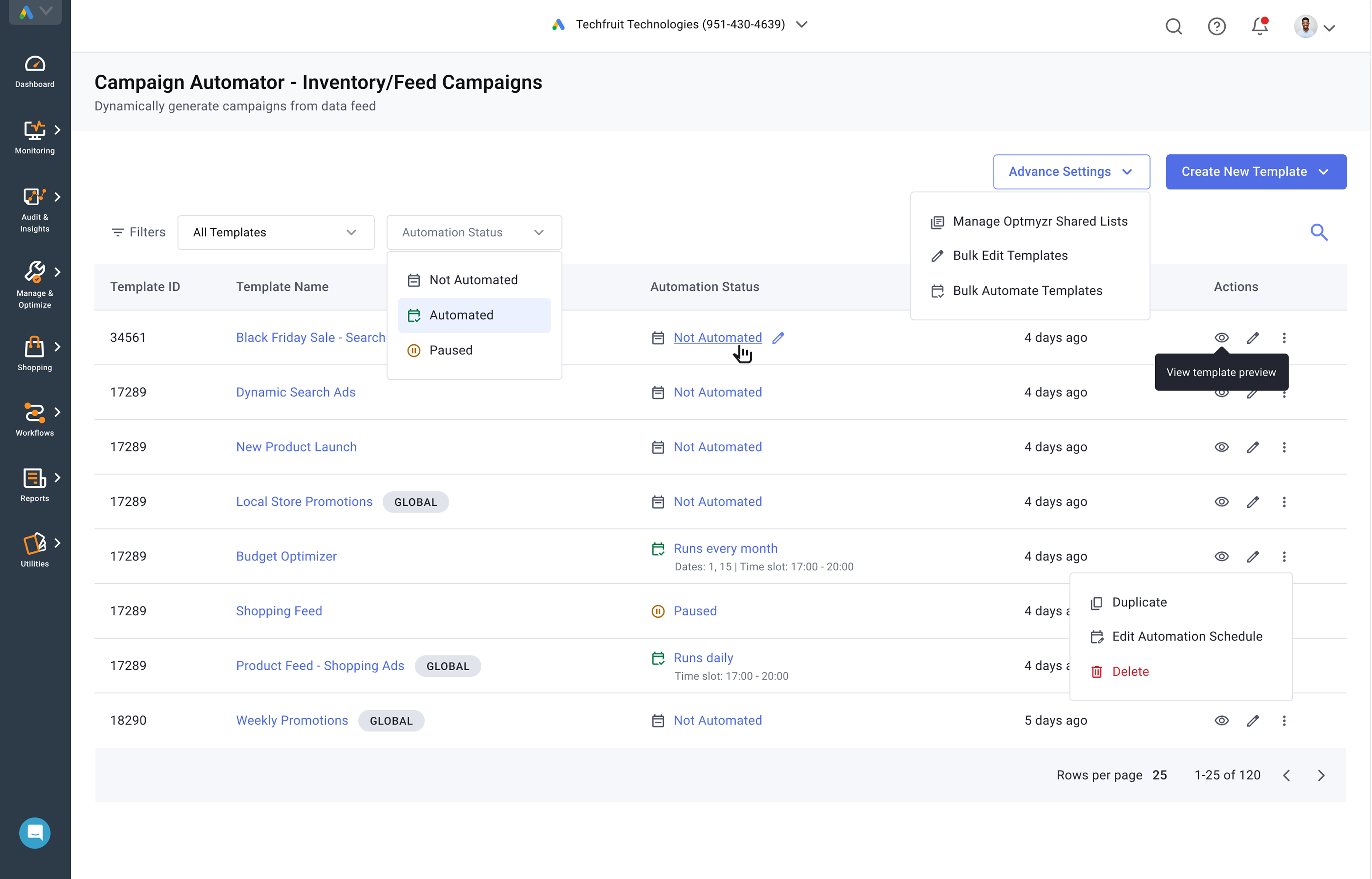
Where the founders' constraint paid off
Forced to work inside the existing layout, I did clarity work that would otherwise have sat behind a rebuild that would not ship for two more quarters. A lot of what looked like missing documentation turned out to be unlabelled interface.
4 · AI-assisted ad creation
Writing ads means producing multiple headlines and descriptions inside strict character limits, and mapping feed columns to Google's fields takes domain knowledge many users do not have. Both were manual, slow, and a frequent source of errors that came back later as tickets. I added AI-generated headline and description suggestions in the creation flow, click to fill, plus automatic column mapping.
One thing worth separating out
AI-assisted ad creation was a committed requirement, not something I chose. It landed in the same quarter as the clarity work, so I designed it in the same pass. I flag it separately because it is capability rather than comprehension, which means the drop in incoming issues belongs to the other three workstreams. I would rather split the credit than let one story absorb everything that happened to ship at the same time.
Section 5 · What phase one produced, and what it taught me
I closed all 143 issues over three months. In the three months after the fixes shipped, 51 new ones came in. That is the number worth stating, because it is not a measure of how much I shipped. It is a measure of how much stopped happening. Two consecutive three-month windows, same product, same intake, both counted the same way, as consolidated issues rather than raw tickets. 143 in, then 51 in.
The part that mattered more than the number. Working through 143 issues by hand gives you something no heuristic evaluation can. An evaluation tells you what is wrong. Working through 143 real issues, and the customer conversations underneath them, tells you what people did when they hit each one.
Once I saw that, the founders' December no made sense in a way it had not at the time. They were not protecting the template editor because it was good. They were protecting it because it worked. Customers had built functioning habits around a badly designed thing, and taking that away to make a working thing nicer is a bad trade. The preview was not in that category. The preview did not work. It reported problems and gave you no way to act on them. The diagnostic half of that screen existed. The corrective half had never been built.
Which changed what phase two even was. Not a rebuild proposal, which had already been refused once. A proposal to build a missing part of the product. Different conversation, different answer.
Do not rebuild what works. Build what is missing.
The principle that carried into phase two
Section 6 · Phase two: the preview
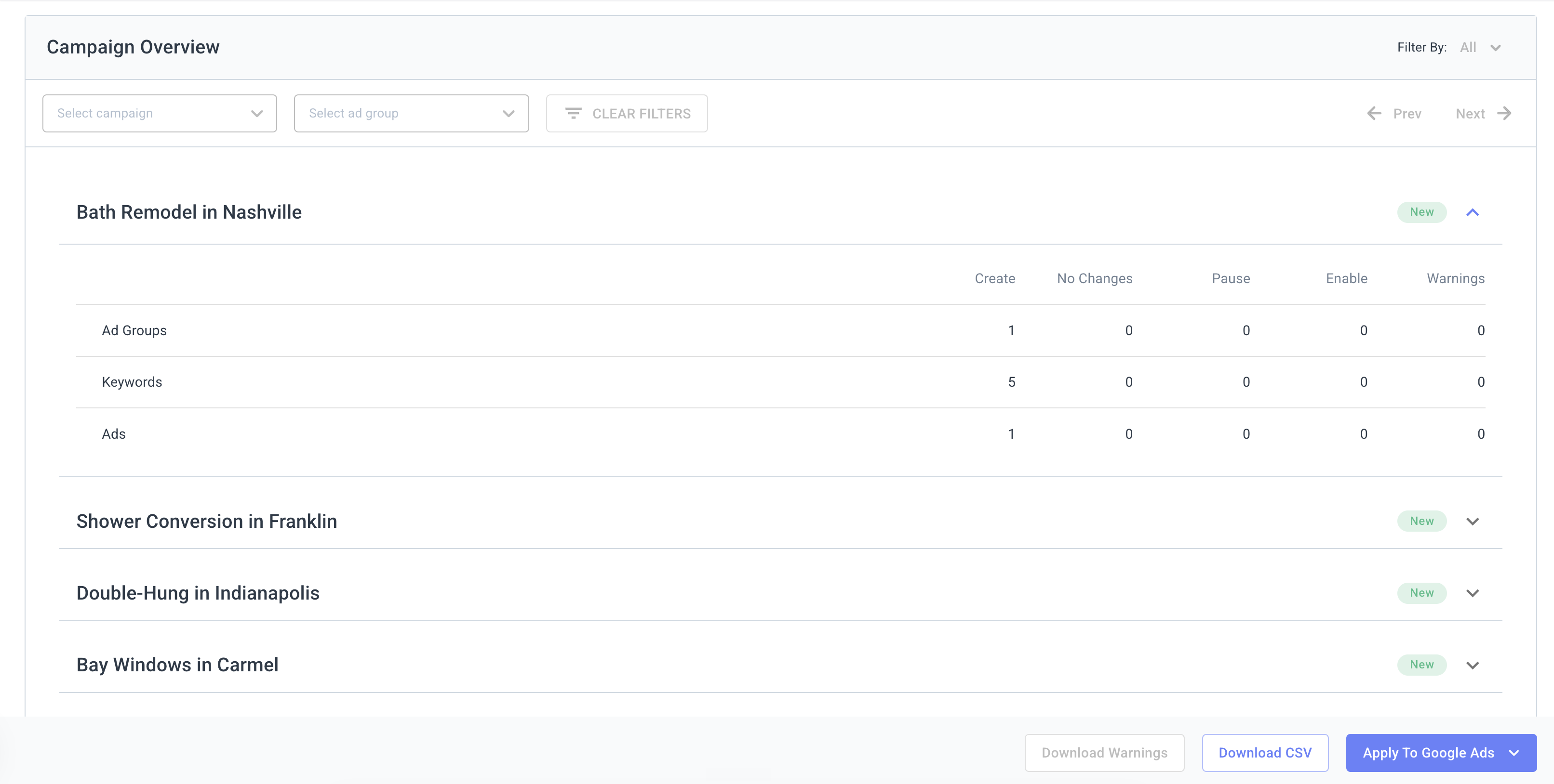
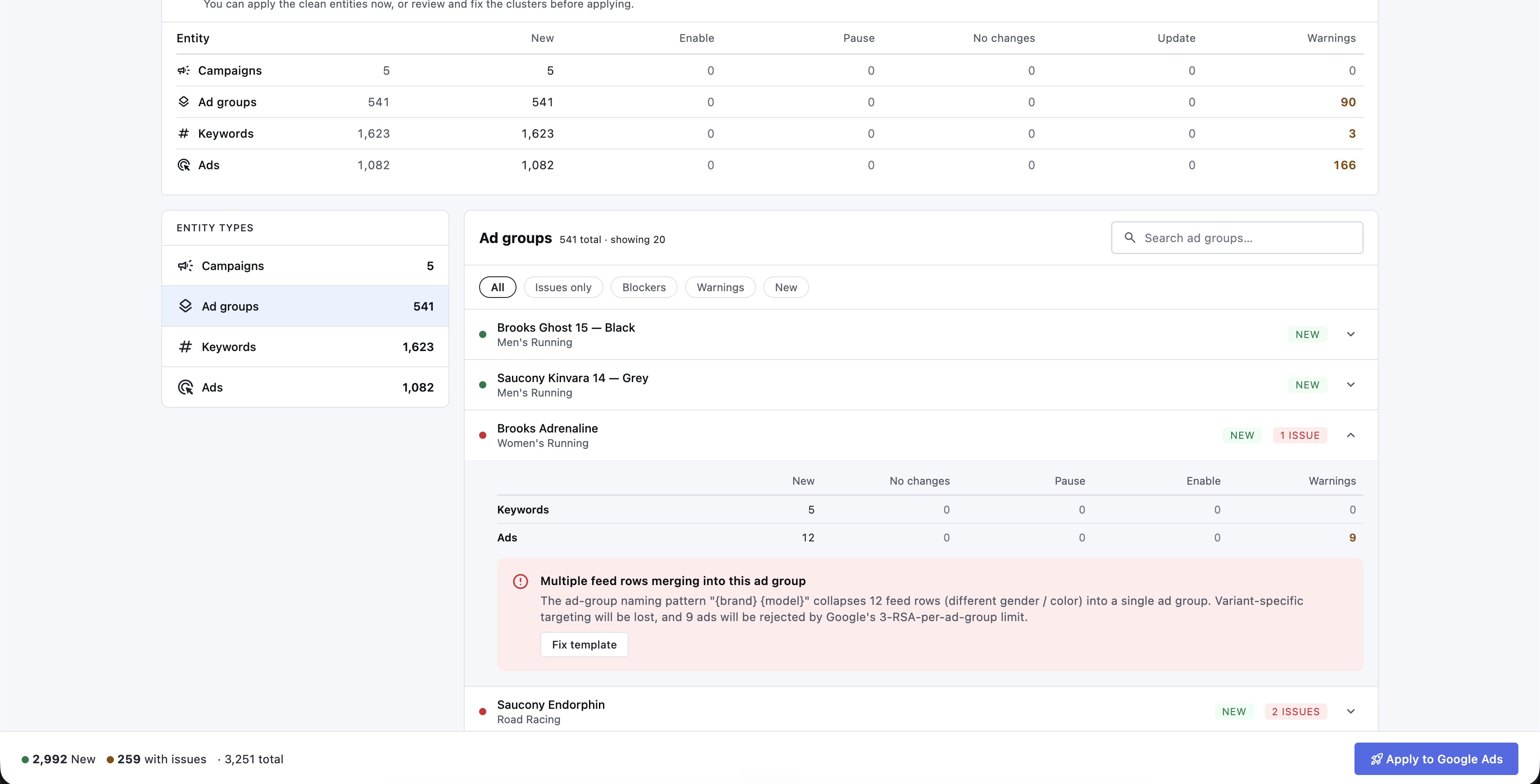
The preview is where a customer sees what is about to be created before it goes live to a real ad account with a real budget. It is the trust gate for the whole product. What it did was list every problem it found, one row per affected entity. Every ad with an issue got a row, every ad group got a row, every keyword got a row. No grouping, no ranking, no way to fix anything from the screen. To fix something you left the preview, went to the template, found the setting, changed it, saved, re-ran generation, waited for the rebuild, and only then found out whether it had worked. A messy run had four or five distinct problems, and each one cost a full round trip.
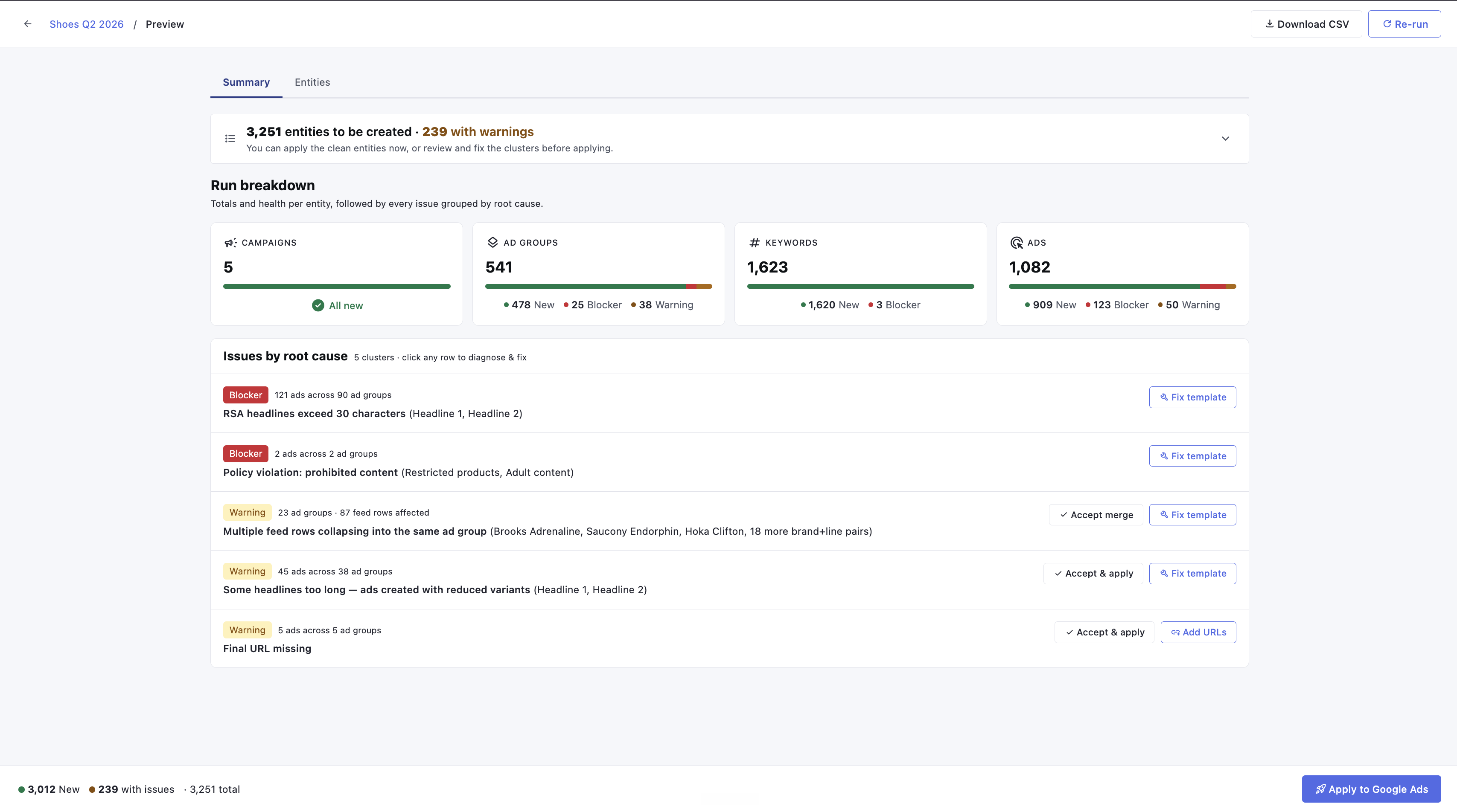
I broke it on purpose. Before designing anything I used the product the way a customer would, to see the failure rather than read about it. Real shoe catalogue as the data source, template built with AI-generated copy. Then I planted exactly one defect: a single headline a few characters over Google's thirty-character limit.
One planted defect →
Three numbers, three places, nothing indicating they were the same problem. The generation logic knew exactly which template line caused all of it. The interface never said so. It takes about ten minutes to reproduce and I can run it live.
A screen that reports symptoms is handing the diagnosis to the user. That is fine when the user has what they need to diagnose, and here they did not, because the mapping from symptom to cause lived inside the generation logic and never reached the screen. So a customer had three options: work it out themselves, which meant understanding how the generator expands a template; trial and error at ten to fifteen minutes an attempt; or ask support. Most asked support. And not "how do I fix this." Fix it for us.
Group by cause, not by symptom. Hundreds of entity-level warnings collapse into a short list of issues, each naming the actual cause in plain language and quoting the real values that broke it. This was not new intelligence, it was surfacing intelligence the system already had and was choosing not to show. One honesty constraint: not everything traces back equally well, and the design says so rather than over-promising.
A screen that claims to diagnose everything and then cannot is worse than one that is clear about what it is certain of. Result: a messy run went from hundreds of rows to a handful of named problems.
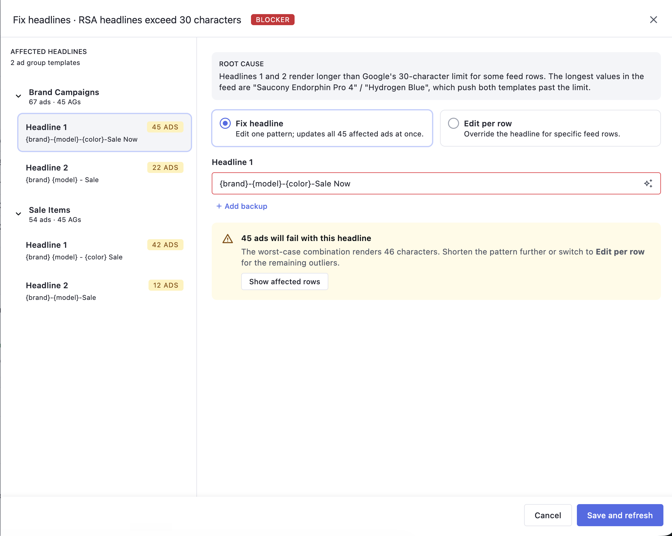
Batch the fixes. Edits collect in a side tray and the preview regenerates once when you commit. My first design saved each fix immediately and regenerated to confirm it. Engineering pushed back and they were right: regeneration is the most expensive operation in the product, and on a large feed each one is a real wait.
Four round trips became one. The trade is that you work without live verification during the batch. I softened it by showing each pending edit in the tray with the specific value being changed, so the batch is reviewable before it is verified.
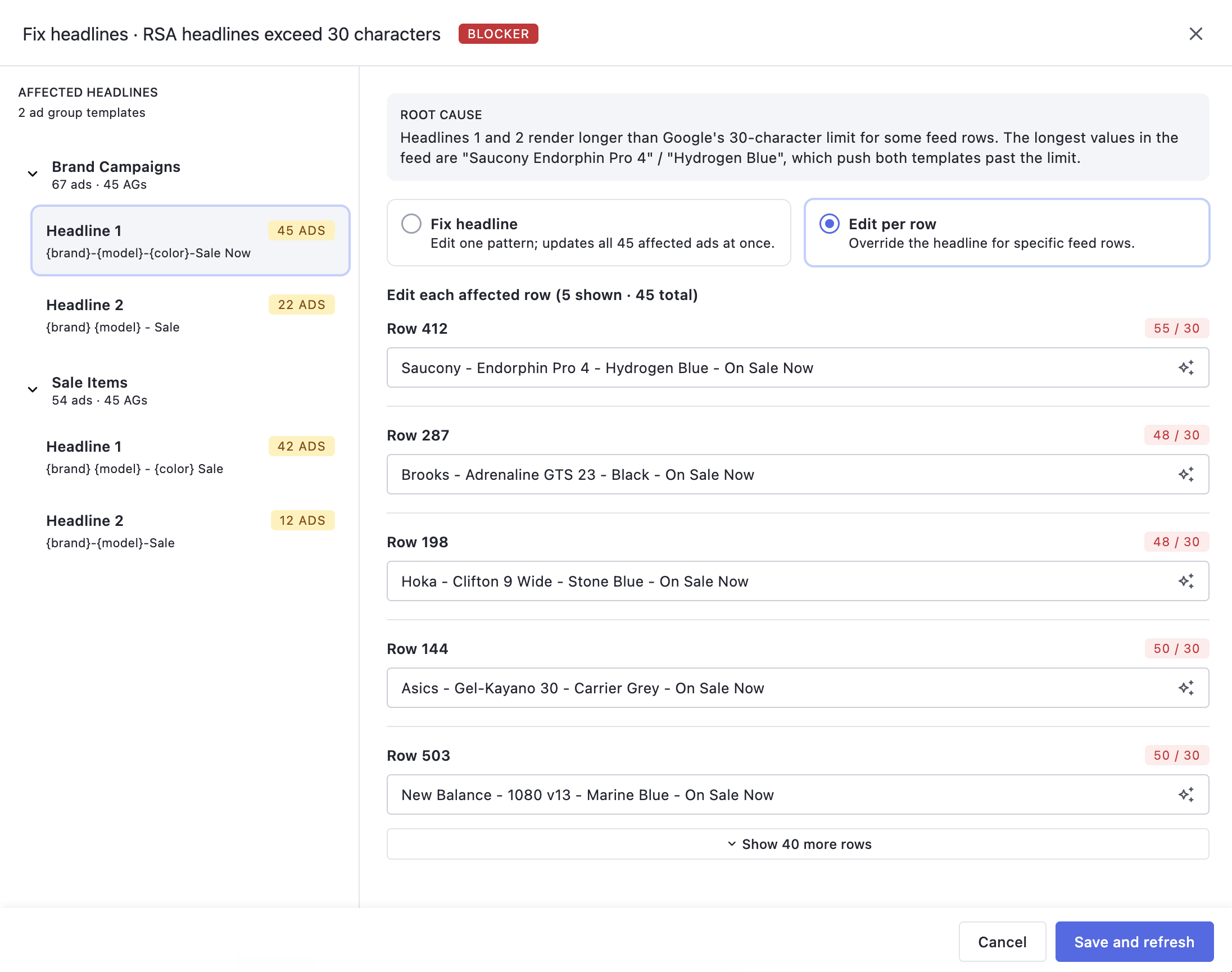
Two severity levels, not four. Red means the ad will not run. Amber means it runs, degraded. That is the whole system. I had designed four levels and lost the argument, correctly. Engineering and my PM pushed back together and their case was operational: every extra level needs a rule that holds across all eight issue categories, and users do not behave differently across four levels anyway. They behave differently across two, things that stop them and things that do not. Support's own language in the tickets already used two words: broken, and ugly.
After launch, support adopted red and amber into their own customer replies without anyone asking. That is the strongest signal I got that the vocabulary was right, and it came from a decision I argued against.
Keep the old table. It moved into its own tab, gained search and severity filtering, and was otherwise left alone. As a primary interface it was bad, but power users had years of muscle memory in it, and some jobs, spot-checking a SKU or auditing one ad group, really are better served by a table. Nobody told me to keep it, which is the clearest evidence I have that the founders' pushback landed as a principle rather than something I merely complied with.
Section 7 · What it added up to
Demand
New issues: 143 → 51
Down about 64%. New issues logged, three months before against three months after. Same tracker, same intake, consolidated issues. Caveats in Section 5.
Speed
Time to apply: −33%
Median, Mixpanel. First preview_loaded to first apply_confirmed, per new template, median across templates so no single heavy user can move it. 8 weeks pre-ship vs 8 weeks post, ship week excluded.
Qualitative
Support load, lighter
Support reports repeat configuration questions dropped substantially. No quantitative read I would defend, so none is attached rather than manufactured.
Why the 33% is a harder test than it looks. After the redesign more messy runs got finished instead of abandoned, so slower, harder templates entered the post-ship data that previously would have dropped out before ever reaching an apply. The median came down anyway, which makes 33% a conservative read rather than a flattering one. What I do not have is active-account counts and templates per day; those lived in systems I did not own and I am not going to guess. A median holds regardless of population size, so the case does not need them.
Why the approach worked. Skipping the redesign meant phase one shipped inside a quarter instead of waiting behind a two-quarter rebuild, and most of it was cheap for engineering relative to the number of issues it closed. And phase one funded phase two, not with money but with evidence. The constrained work produced the proof that got the structural work approved after the same idea had been refused cold.
Who moved this with me.
Support
Held the context behind every issue
Corrected my reading of the ones I got wrong, and knew who was behind each consolidated line. The two-word severity vocabulary is theirs.
Product
Tied every decision to a consequence
Kept each call tied to a business consequence, and teamed up with engineering to kill my four-level severity system.
Engineering
Reshaped the fix loop
Flagged the regeneration cost that changed the batch design, and absorbed the state complexity of batch creation.
Founders
Set the constraint
Refused the rebuild, and were right to. The constraint produced the evidence that got phase two approved.
Section 8 · What I am taking with me
The biggest thing for me is I don't have to sit and work it out anymore. It tells me what broke, I fix it, done. Before, I'd be jumping between the preview and the template guessing which setting caused it, and half the time I'd just give up and message support.
Enterprise customer, on the redesigned preview