Scoro · flexibility
Organises the whole product around five roles, then hands you a blank widget library to build your own dashboard. The CEO view is just the default. Flexible, but it hands the work to the user, and most users never do it.
Keka PSA is the tool services companies run their client projects on. Everyone logs into it, but a project manager, a client manager, a finance manager, a resource manager and a CEO don't do the same job, and they were all looking at the same dashboard, built around a single project. I redesigned it so each of them lands on a view built around their own work.
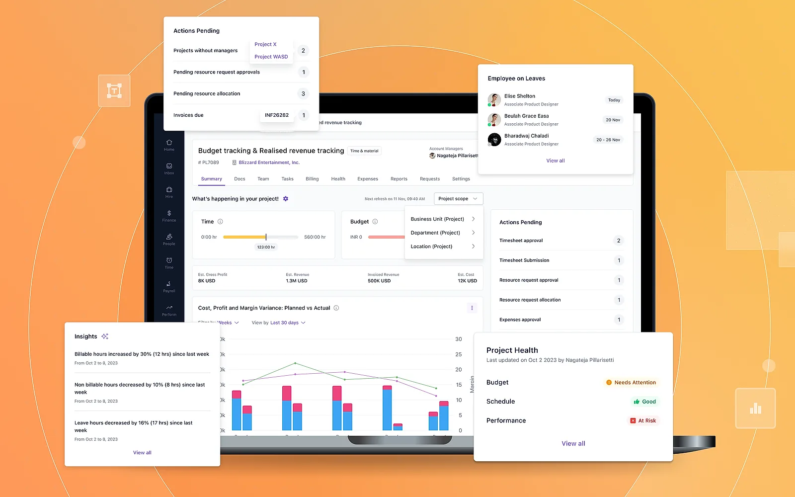
One project-shaped dashboard was serving five people whose work is shaped differently, so four of the five were pulling data out of the product and finishing the job in Excel. That quietly cost the product the clean data it needed to be worth using. I defined five personas by the first question each asks in the morning, then built one library of widgets that can each be pointed at a different level of detail, which is the only reason five dashboards were affordable to build. The real difference between the views turned out not to be the charts, but the Actions Pending panel: same platform, same data, completely different definition of what's on fire. Every widget got a full set of states, including the awkward ones. All five dashboards shipped and are documented in Keka's help centre.
Section 1 · The problem
Keka PSA had a single dashboard, and it was scoped to a single project. That's fine if managing one project is your job. It falls apart the second your job is something else.
A resource manager trying to answer "which roles am I short on next month" was opening projects one at a time and adding it up in her head. Finance was visiting every project page to hunt for overdue invoices, then rebuilding the whole list in Excel anyway. A client manager would walk into a review without knowing which of that client's projects were in trouble. The CEO asked for a summary and waited a week for someone to build a deck. Four out of five people were doing the same thing: they pulled data out of the product and finished the job somewhere else.
The second problem is the one that bothered me more. When a dashboard can't answer your question, you stop trusting it. Once you stop trusting it, you stop bothering to keep the data clean. Budgets don't get entered, estimates get skipped, timesheets go in late. Then the dashboard gets even less useful, and round it goes.
The problem in one sentence: one project-shaped dashboard was serving five people whose work is shaped differently, so most of them were doing the analysis by hand, and the product was quietly losing the data it needed to be worth using.
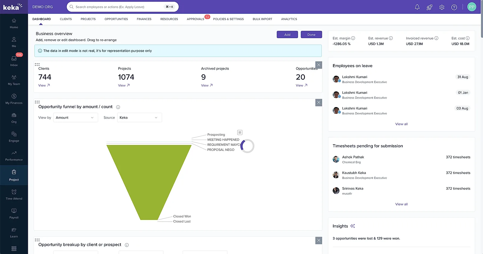
Section 2 · What a PSA tool is, and why dashboards are hard in one
PSA stands for professional-services automation: the system a services business runs on. Consultancies, agencies, IT firms. It pulls together four things that normally live in four different tools: the projects themselves, the people staffed on them, the time and expenses those people log, and the money side of budgets, rates and invoices. In Keka you set up a client, add projects under that client, put people on those projects at a billing rate, and they log time against it. That time eventually turns into an invoice.
Here's the part that makes dashboards genuinely hard. Take utilisation. To a resource manager it's a staffing problem: somebody is idle, or somebody is drowning. To a project manager it's a delivery problem: my team is burning hours faster than we planned. To a CEO it's a business problem: are we selling enough work to keep people busy. One number, three completely different reactions. So it isn't enough for a dashboard to show the right numbers. It has to show them at the right level, in the right order, with the right thing pushed to the front.
Section 3 · Research
I started inside the company: support tickets, sales calls, whatever CS kept running into. The pattern was consistent, and a bit surprising. Nobody said "the dashboard is bad." What they said was "can you add a report for X." Every single one of those requests was somebody trying to get to their own level of detail.
Then we looked at how mature PSA tools deal with this. Mainly two, and they fail in opposite directions.
Scoro · flexibility
Organises the whole product around five roles, then hands you a blank widget library to build your own dashboard. The CEO view is just the default. Flexible, but it hands the work to the user, and most users never do it.
Kantata · permissions
Goes at it through access groups named after what you're allowed to see: Reports Viewer, Reports Viewer With Cost, Collaborator. Easier to build and maintain, but nobody actually knows which one they are.
What we took from it
Flexibility on its own isn't a solution, and naming everything after permissions just confuses people. We wanted a genuinely good default per person, with the option to change it.
We also spoke to customers across the different roles. The most useful thing that came out of those calls wasn't which chart people wanted. It was what each person's first question is when they open the tool in the morning. Those questions turned out to be totally different from each other, and that ended up being the spine of the whole design.
Section 4 · The five personas
We landed on five. For each one I wrote down their first question of the day, and then what a single row actually means to them. That last column is the one that mattered. It's the actual difference between the five views. Once I knew what a row meant to each person, the rest mostly followed: which charts, how to group them, what goes first.
| Persona | First question of the day | What one row means to them |
|---|---|---|
| Project Manager | Is my project going to land on time and on budget? | One project |
| Client Manager | Is this account healthy, and do they owe us money? | One project inside one account |
| Finance Manager | What haven't we billed, and what hasn't been paid? | One invoice or expense |
| Resource Manager | Who am I short of next month? | One person, role or skill |
| CEO | Is the services business healthy? | The whole company |
Five first questions, five definitions of a row. The rightmost column is the design brief, not decoration.
One persona sat apart from the others. Everybody except the resource manager is looking backwards, checking what already happened. The resource manager is the only one who has to predict something. So theirs is the only dashboard built around forecasts rather than history: capacity coming up, unstaffed demand, bench trend.
Section 5 · Solutioning
The obvious move is to design five dashboards. I didn't do that. It's five times the design work, five times the build, and they'd drift apart the moment anyone touched one of them. What I did instead was build one library of widgets, where each widget can be pointed at a different level of detail.
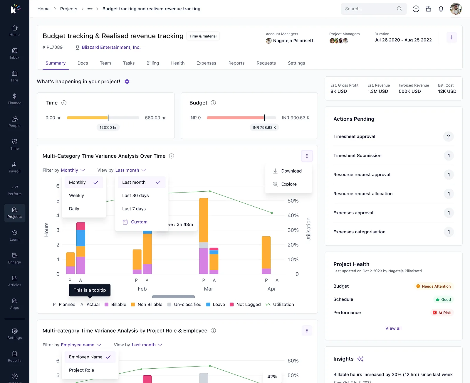
Take the time-variance chart. It's one widget. The project manager sees it grouped by employee, the client manager by project, the resource manager by client. Same widget, same underlying data, different grouping. Margin variance works the same way: by week for the PM, by project for the client manager, by job title for the resource manager.
This is the only reason five dashboards were affordable to build. It also means fixing one widget fixes it everywhere, which matters more than it sounds like it should.
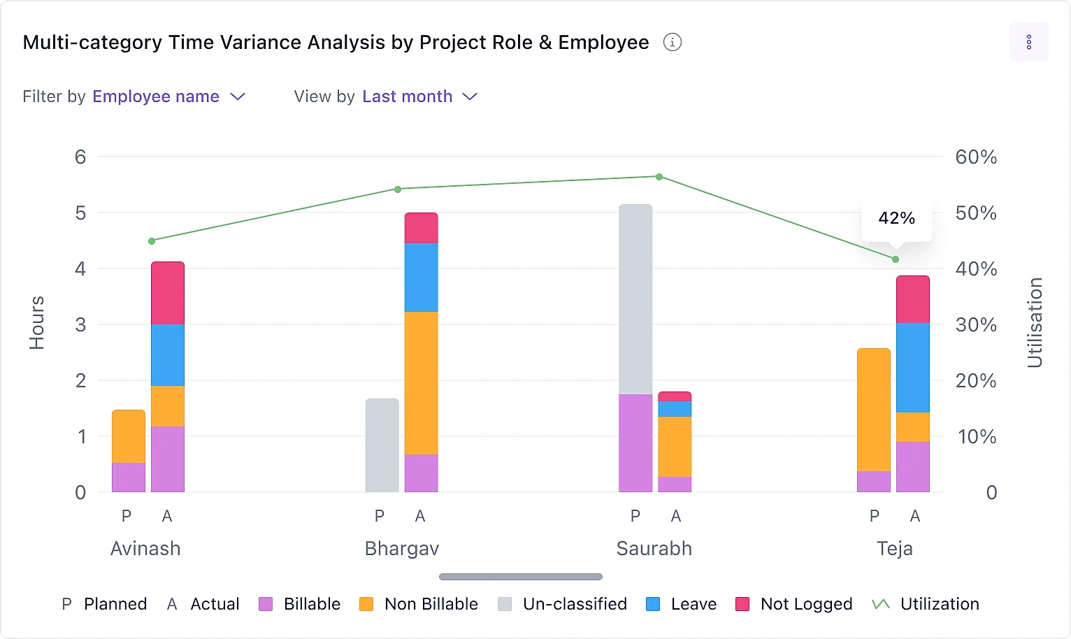
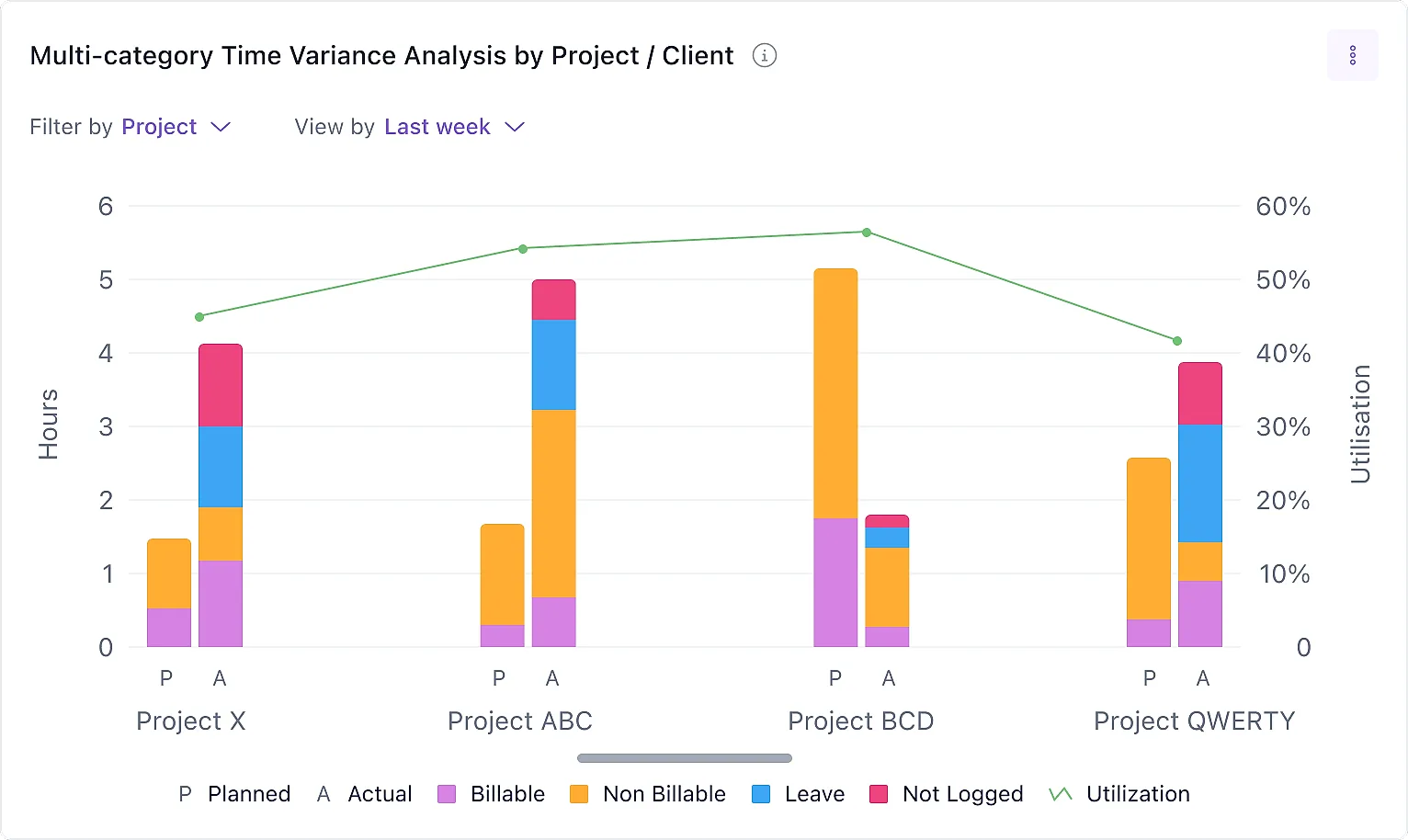
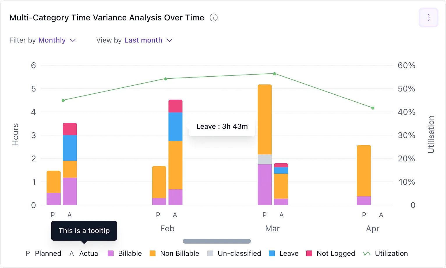
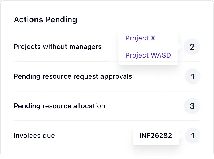
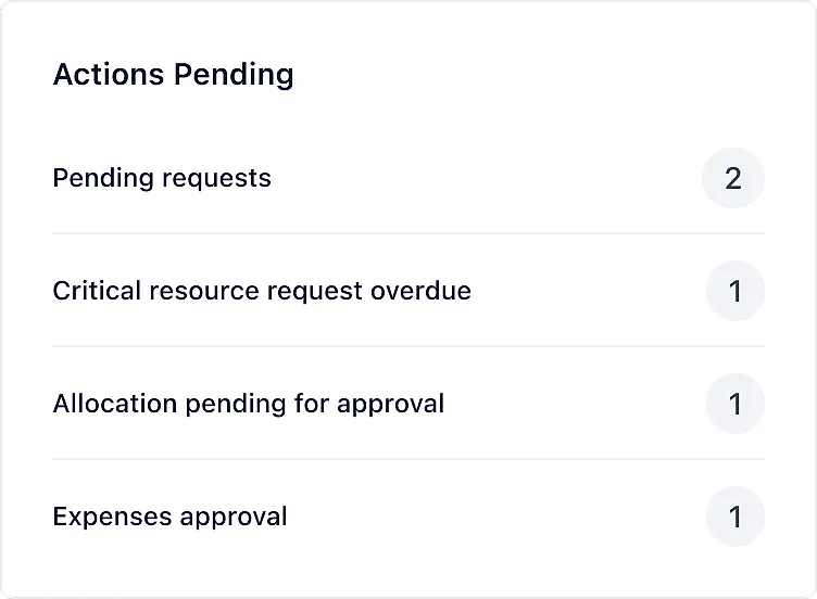
The real difference isn't the charts. This one caught me off guard. The charts overlap quite a lot between personas. What doesn't overlap at all is the Actions Pending panel, the list of things waiting on you.
Project Manager
Timesheets to approve, expenses to categorise, resource requests to sign off. The job is unblocking delivery.
Client Manager
Projects with no manager assigned, invoices coming due. So it's governance gaps and money owed.
Resource Manager
Overdue requests, allocations waiting on approval. Which is just their staffing queue.
Same platform, same data, and yet those three lists have almost nothing in common. That's really what a persona dashboard is. It isn't a different set of charts so much as a different definition of what counts as on fire.
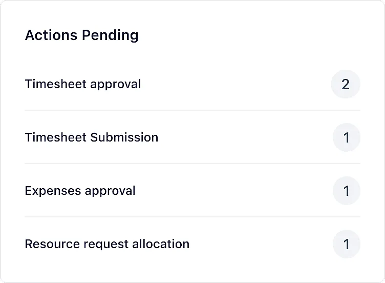
Design decisions. Five that did the most work:
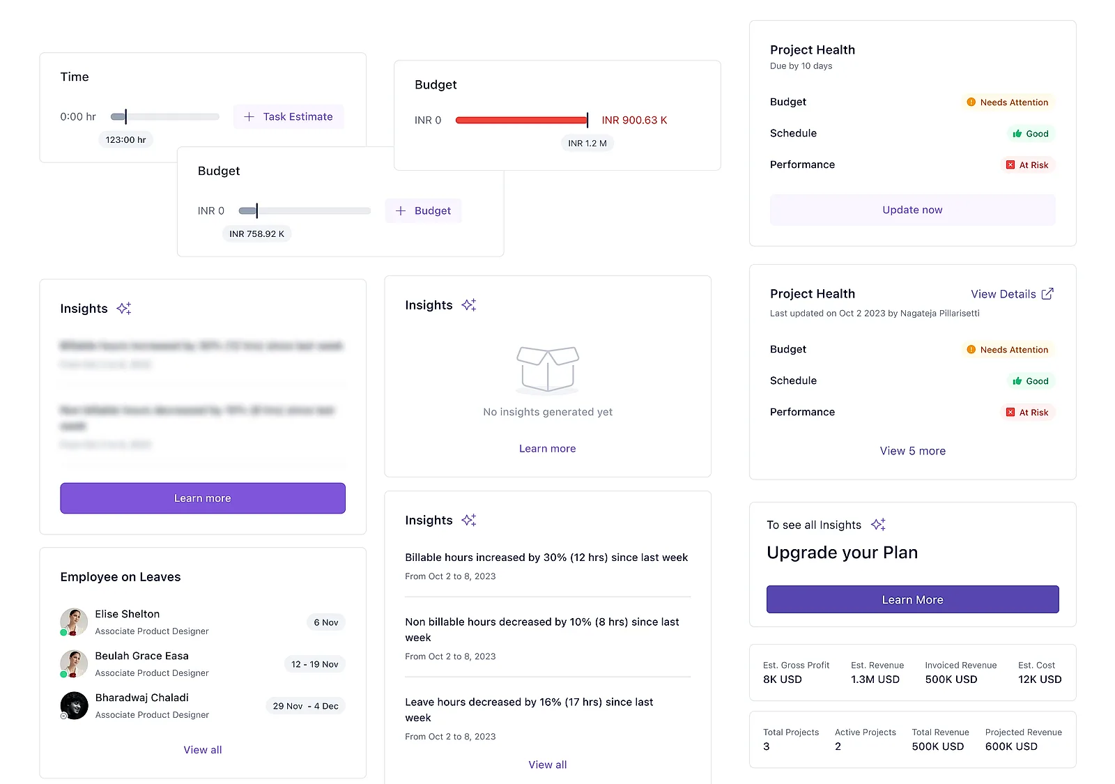
Empty states became setup buttons. If a project has no budget entered, the budget bar doesn't show zero and it doesn't throw an error. It shows a "+ Budget" button. Same with "+ Task Estimate" where there's no estimate. A good chunk of why the old dashboard felt broken was that nobody had filled in the data behind it. So rather than report the gap, the widget became the place to close it. The dashboard does the nagging for you.
Locked by permission and locked by plan look similar but go different places. Both are blurred content with a button on top. Account Health without permission says "Request Access" and sends you to your admin. Insights on a lower plan says "Learn more" and sends you to an upgrade. Getting these two mixed up would be irritating in one direction and slightly insulting in the other.
Show when the data is old rather than pretending it's live. The data refreshes on a schedule, not in real time. Instead of hiding that, the header tells you when the next refresh is, and Project Health shows who last updated it and when. The attribution matters as much as the timestamp: "last updated by Nagateja" turns health into something a person owns instead of a number that appeared from nowhere.
A strong default that you can still change. Each person lands on a view I designed for them. They didn't ask for it and they don't have to set anything up, but they can drag widgets around and pull more in from a searchable library with live previews.
Every widget got a full set of states. Not just filled and empty, but not-set-up-yet, threshold breached, stale, locked by permission, locked by plan, collapsed and expanded. Project Health alone has six. This was easily the least glamorous part of the project and probably the most useful, because it's the difference between a dashboard that looks good in a review and one that survives contact with real data.
Section 6 · Where it landed, and what I'd change
All five persona dashboards shipped. Keka's own help documentation describes them, including the chart lists I designed. So the rest of this section isn't a defence. It's the part I'd want a designer reading this to push on: what I set up to measure, and what I'd change if I did it again.
What I'd measure. I don't have adoption numbers for this. So here's what I set up to be measurable, and why each one is worth watching.
What I'd change. Being straight about the gaps.
There's no dashboard for the team member, and they're the largest group of users as well as the source of every hour of data the other five dashboards run on. Looking back, theirs probably should have come first. People also wear more than one hat: in a forty-person consultancy the project manager is also the resource manager and probably sends the invoices too, so five dashboards means five places to go, and it needs a switcher. Account Health leans entirely on colour (red, amber and green in a grid, with nothing else carrying the signal), so it needs a shape or a letter or a pattern to still work for colour-blind users. Two charts share a title on some pages ("Cost, Profit and Margin Variance" turns up twice, once by time and once by project) and the title doesn't say which. And the project manager view is dense: eleven charts plus four side panels. For a screen whose entire job is telling you what's wrong, I never properly argued for what has to be visible before you scroll, and I should have.
A persona dashboard isn't a different set of charts so much as a different definition of what counts as on fire.
The one idea the whole project turned on